

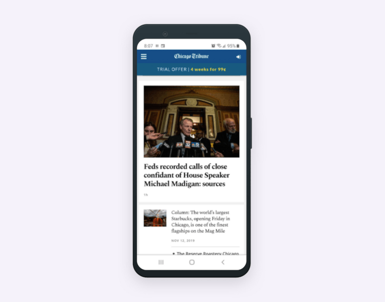
But why this way? These days, many users prefer to view web pages from smartphones as it's convenient. Based on this factor alone, it's already worth thinking about mobile-first development. Another reason is that you’ll get a good layout of elements, correctly working links, and prevent making a rough mobile version of the site.
In this post, we'll consider each type of design, how they differ and give you some tips to succeed when you decide to create a website design.
The difference between adaptive, responsive, and mobile-first design
Let's take a closer look at each type of a website design.
Adaptive design
This design consists of several layouts with different placement of elements adapted to various screen sizes:
- For smartphones – 4'-6'
- For tablets – 7'-11'
- For desktops – 12' and more
So, when you open a website, the browser engine determines the resolution, screen size, and aspect ratio. In other words, the content changes dynamically here. These factors help you choose the right layout and select it for a specific device.
Check out the illustration above.
Responsive design
Responsive design has another distinguishing feature – the ability of a website layout to widen or shrink depending on the width of the user display. And the page will rearrange all its elements even if the window changes by one pixel.
If you choose this approach, you'll save money and time on the mobile version design. Regardless, you should always make sure that all the elements will look well on various devices.
Mobile-first design
The mobile-first strategy works this way: the design is first created for mobile devices and adapted for desktops after that. That is, the designers follow the principle of crossing from small screens to large ones here.
Why so? The main goal of this method is to place text, functions, buttons, and other important content in a limited space. Moreover, all these elements must be clearly visible and easily accessible.
Also, with this method, mobile pages will look better than in the case of responsive-first or adaptive-first design creation.
Why is mobile-first design so crucial for business?
A mobile-first development strategy it's a good choice not only for businesses striving to increase their revenue but also for those who decide to launch a new project. Why?
The average conversion rate on mobile devices increased by 64% compared to desktops. Moreover, websites' mobile versions are very carefully evaluated by Google for correct ranking.
By choosing this strategy, you also allow your customers to be able to access content swiftly. Take into consideration – the fewer elements the page has, the less loading time it requires. And the conversion rate decreases by 7% with every second of delay.
Work on website content
When developing, keep in mind that users should get only needed content. To succeed here, look at it through the users' eyes for whom you are building your website.
If there is a strong space restriction your UI/UX team has, they delete all the needless elements and leave the most essential. This way, you can keep users' attention on the main thing.
Desktop and mobile users have different needs. Therefore, you can delete all unnecessary elements from the mobile version of the site and leave them on the desktop. Often, desktop users' needs are detailed information and additional functionality that isn't needed for the mobile version.
So, website design's primary goal is to place all website elements in the appropriate places.
Hints to mobile-first design creation
Here are the following tips to help you cope with a mobile design easier, considering the importance of the content:
- Draw up the list of all the content you want to see on your website.
- Prioritize elements of the content and place them in the most seeable place on your website.
- Work on your design consistently. Let your team create designs and wireframing – first for small screens, then for large ones. This way, the team can embrace screens of different sizes, from mobile to desktop version.
- Enlarge all navigation and interactive elements. It is necessary so that the user's interaction with them on the screen will be more convenient. After all, the area of fingers touching is larger than a pixel mouse. So, you can follow Apple recommendations: make the touch area of 44 pixels. Besides, don't forget to provide the hyperlinks and all interactive elements with enough area and make its size bigger if necessary.
- Imagine that you have not a website but an app. So it’ll be easier for you to understand how to create widgets, AJAX requests, plain navigation, and other elements, because users are accustomed to certain patterns of interaction with the app.
- When creating graphics, keep all the elements simple and small. If you make a huge graphic, it won't display well on a small screen.
- Make a safe content area. No elements should cling to the edges of the screen. To avoid this, you can make a space of 16 pixels. Again, it's an Apple recommendation.
- Typography. Make the font size of the main text at least 16 pt. The line spacing should be sufficient for easy reading.
Summary
Summarizing the aforesaid, it's necessary to point out that a well-designed UX should always be at the product's core. The mobile-first development strategy is considered one of the most difficult but prospective approaches. And it doesn't matter whether it's a commercial organization or other products that depend on the modern fast life pace – the mobile-first approach suits all of it.
So, deciding to use such a method, you can consider our tips, and a good result will not keep you waiting long.
Author’s bio
 Vitaly Kuprenko is a writer for Cleveroad. It’s a web and mobile app development company with headquarters in Ukraine. He enjoys writing about technology and digital marketing.